Wednesday, 9 April 2014

Evaluation question 3: What have you learned from your audience feedback?

What have you learned from your audience feedback?

I uploaded my final completed music video to social networking sites to gather as much possible audience feedback as I possibly could. I uploaded the video to Facebook, Twitter and YouTube in search of a decent response in terms of analytical feedback. I gained a great insight in terms of my videos strengths and weaknesses, I learnt on things that could have been of been better such as more varied camera shots, improvement in lyric syncing and more relevance to mise-en-scene. I also learnt from the audience on what went well from my audience feedback, I had complements which showed that people appreciated the video.

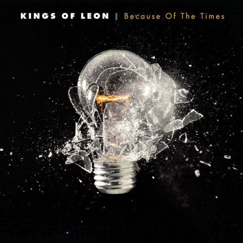
I also uploaded my two ancillary tasks to social networking sites, again I did this to gather as much possible audience feedback as I could. I uploaded my CD cover and magazine advert for my chosen artist Kings of Leon. Again the response was varied with mainly positive feedback.


The screenshots above are feedback about my music video, they are very detailed which means I have a very strong response which I can learn greatly from. I have learnt that people enjoyed the steadiness of my camera shots, they said it made my video look really professional. I had positive comments on the variation of camera angles, and variation of things to look at which keep the audience on edge and keeps it interesting to watch. I had positive comments on the concept of the video linking to the song and music really well, showing a good understanding and connection between the two. I also had positive comments on the camera angles showing expressions and linking to the lyrics really well. There were also comments on the lip syncing being doing well, which I disagree with because I think the lip syncing is bad and out of sync, but there have been several comments saying it was good. There were also positive comments in regards to the character interacting with the audience in terms of looking into the camera when singing to show emotion. I also received positive feedback on the burying of pictures and burning of pictures, saying that it links well to the concept of the song and in relation to the lyrics, showing a strong understanding of the song.

Negative feedback on the music video was with the lip syncing, in some scenes, which I do agree with and something I am critical with myself, is the lip syncing is off and out of sync, obviously it makes the video look a bit under par and out of performance, something I willingly take responsibility for. If I could go back, I would re shoot the lyric scenes and tidy it up so it looks as professional as possible. Another negative aspect from the audience feedback was the repetitiveness in scenes, especially at the chorus, which again is understandable but I did this to show editing and to show some repetitiveness. I don't think having the same clip shown multiple times is bad at all as many videos do this, especially Kings of Leon.


The screenshots above are feedback for my ancillary tasks (magazine advert and CD digital pack) I received alot of positive feedback for my ancillary tasks, many people commented on the similarities of the colour scheme and the consistency between the two, showing a unique brand identity. I had comments on how professional it looked and that both ancillary tasks show they belong to one artist/album. I also received positive feedback on the image I used for the ancillary tasks (the sunset) saying it looked very professional and photogenic and fitted in to the concept really well with the album name being Come Around Sundown. I also received positive feedback on the location choice of the shot saying it fitted in well to the music video and linked together really nicely.

Comments in regard to improving the ancillary tasks were to have more image selection which is understandable but I wanted to keep a consistency as Kings of Leon do this for their brand identity. There were also comments on having more colour for the inside cover, again understandable but something I didn't feel the need to pursue as I felt it all looked fine and professional, I didn't want to overload with text.

Monday, 31 March 2014

Evaluation question 2: How effective is the combination of your main product and ancillary texts?

How effective is the combination of your main product and ancillary texts?

I feel that the combination of my main product and two ancillary tasks are really effective. This is because firstly I did a lot of research and planning in relation to the albums and magazine adverts by Kings of Leon. In the research and planning stages I took a lot of time to analyse the albums, going through in detail their positive and negative features and how they relate to the song and to the music video. I also did an analytical report on three music videos by Kings of Leon comparing them for strengths and weaknesses and also talking about similarities and differences.


In terms of the effectiveness of the combination between the music video and ancillary tasks firstly we don't break out of character on any of it, in the music video the character is a sad lonely isolated figure, this is backed up in the image of the sun setting going into the darkness connoting that our character in the music video was a happy laid back guy but now for reasons put upon him he has now changed and his darker side has shown.

Their is also a strong effectiveness in terms of the location and setting used for the music video and two ancillary tasks, the setting is in the countryside, an isolated location where the music video is filmed, we then see in the ancillary tasks the images used are of a sun setting into a mysterious isolated countryside area.


The ancillary tasks combine well and are very efficient and consistent in terms of the colour scheme and font size/colour/style used throughout. I kept it consistent to make it look very professional and to make it look really realistic. I followed the pattern from previous Kings of Leon digi-packs, as they keep the same font choice throughout and the same setting which I have with the two images set in exactly the same place but from different angles and a contrast in only the editing.

The whole concept of my music video which is after the song named Pyro which is short for pyromaniac (obsession with setting things on fire) I linked the concept of this to my two ancillary tasks with the sun which represents fire and represents the album name 'Come Around Sundown' this means I could link the concept all together with the 'Pyro' (fire) linking to the sun (Come Around Sundown) meaning it all made sense and made the combination effective and worthwhile. It all works together well and it all links, as the video and ancillary tasks are in two different types of media, one being a moving visual film, and the other being a text based document advertisement, it was hard to combine the two as they both have different concepts behind them, but I did my best to make them as part of a brand identity by studying Kings of Leon videos, magazine adverts and CD covers to make sure I could link them all effectively in terms of combination.


Tuesday, 18 March 2014

Image manipulation

Here is a shot of the image I used for my album and magazine advert being manipulated, I changed the colour to a more darker shade and had to do some editing at the bottom to get rid of a trampoline that was making the image look unprofessional. 


Final Music Video

Here is my final and completed version of my music video.

The song is called Pyro by Kings of Leon from the album Come Around Sundown..


Friday, 14 March 2014

Editing film footage for music video

Here are some screenshots of my editing of the music video, I have been using Imovie on the Imacs to edit and transform my video footage into a professional music video. Here are screenshots of the footage compiled together along with sound editing and some clip cutting editing techniques. 


Friday, 7 March 2014

Update shooting schedule

With the weather being bad, I had to delay my shooting to the end of February and beginning of March, due to flooding and bad conditions.

I found a day and location where the weather was very good, the best so far this year...


This is perfect weather for filming, meaning that it will fit my music video and song name as it is Come Around Sundown, Pyro..

Creation of barcode

I used Adobe Indesign to create the barcode that was going to be placed on CD packaging..

Here is a screenshot of the creation of the barcode...


Here is my barcode up close...


Friday, 28 February 2014

Development of CD Cover and Magazine Advertisement

This is an development example of my final CD cover that I will be pubishing. I am currently through the development stage and things are still to be changed, hence the lack of quality in some of the images and text. 

Stage 5
Stage 4
 Stage 3
 Stage 2
 Stage 1


Just like my CD cover, I am still in the development stages of creation for my final magazine advertisement that is nearing completion but there is still things to be done, as you can see with the borders that need to be edited out and the positioning of text will also be changed.

Stage 3


Stage 2


Stage 1


Monday, 10 February 2014

CD Packaging for Kings of Leon

Come Around Sundown - Kings of Leon (2010)


Colour

F: The album cover is dominated by the image of a sunset across a river, lake, the sea or an island. The colours are very peaceful and relaxed, the different shades of yellow and orange with the dark shades of the land and palm trees all really fit in well to the image. The colours are very warming, which is reflected as Kings of Leon are from the southern states in America so this kind of weather is very common so it reflects there culture. The music on the album also integrates well with the cover of the album because the music is very peaceful and relaxed. The colours also link to the album name well, which is Come Around Sundown as the image clearly shows the sun setting.

B: The back cover is very similar to the front in term of the sun setting background it has with the white text over it. The band are seen all standing together with the sun beaming in between them, the dark and light shades are still there but the text is all cleverly hidden into the dark shades otherwise it wouldn't be clear if it is was shown in the brighter parts. There is a cream border around the edge of the back cover to allow all the textual information to be shown clearly.

Brand Identity

F: The brand identity is kept consistent throughout most Kings of Leon albums, the band keeps the same costume in all of their images, they keep a consistency in their font and text colour and style. They keep a consistency in positioning and layout throughout their albums. Obviously every album has to be different and has to have a uniqueness that keeps it different to others.

B: Again like the front, the back keeps to the brand identity by keeping the same costume, colour and positioning of font, images and other key information. 

Layout & Positioning

F: The image is dead in the centre of the album cover with the text being at the top of the album and the bottom. The artist name is at the top of the album, and the album name Come Around Sundown is at the bottom of the album. I think this has been cleverly crafted to have the album name which is Come Around Sundown at the bottom due to the sun setting so the album name is also setting.

B: The layout at the back of the album is obviously and understandably very different to the layout of the front cover of the album. The track listing is over to the far right in a white font over the sun set background with the band all standing together. There is a border around the image of the band and all the textual information is around that, the bar code is at the bottom as this is where the majority of albums keep their bar codes

Shot choice

F: The shot choice is clearly a long shot and an establishing shot, it has been taken far out to allow the viewers to see the full effect of the sunset and to show the water reflecting the sun back into the sky to create this very warm and nice feeling of relaxation.

B: The shot choice of the image taken is a medium-long shot, it can also be seen as an establishing shot. The shot taken allows the viewer to see the full view of what the band are seeing, the light brightens up the album cover.

Framing

F: The framing of the shot is actually very clear, in some parts of the image it is blurry but that is only because of the sun light reflecting from the water into the camera lens.

B: The framing of the shot at the back of the album is quite distorted and blurry due to the sun shining into the camera lens, this creates the different shades of colours.


Lighting

F: The lighting in parts is very bright, in other parts it is very dark, for me it looks like the transformation is happening with the sun setting, the night is appearing, the dark shades in the image are to connote the night time which is about to start, with the bright patches connoting the album Come Around Sundown, it all links in together well. The land and palm trees are also in a very dark shade but that is to add effect so you can see them clearly otherwise the sun would distort them.

B: The lighting carries on from the front cover in terms of the different dark shades that complement the white text that goes over it. The shot is bright in the centre and is dim/darker around the edges so the text can be seen.


Location

F: The location of the choice has to be in Southern America where Kings of Leon are always filming their music videos and its where they live and where they grew up. The reason for this location being used is due to them being from the South of the American states such as Louisiana, Texas and so on, they needed to make the viewer understand there background more and by using an image of close to where they are from, they are bringing back their roots, which they do in this album with a lot of their songs.

B: The location is the same as the where the front cover shot was taken ^


Font choice

F: The font choice is in capitals again, to make it stand out. The colour of the font is in white and it is very plain, but it does stand out well in the image, although for an older person or someone with bad eyesight it would be very hard to see from a distance so they would be relying on the album cover to be popular and well known.

B: Again the font choice replicates and is kept consistent just like the font is on the front cover of the CD. The track listings are in capitals letters, and so are all the other textual information such as the information of the producer etc.


Language choices

F: The language choices are very basic, they just have the band name 'Kings of Leon' and the album name 'Come Around Sundown', there is no other textual information, mainly due to the artist relying on its reputation and its album cover to be more known.

B: The language choices are very basic, getting to the point. There is a lot more sophisticated information but that is in a much more smaller font, this is all the legal information and producing information that has to go onto the back of the CD for proof etc.


Because Of The Times - Kings of Leon (2007)


Colour

F: The album cover is very dark and almost looks horror like with the light bulb and the x-ray image of the skull which appears in a very clear and strong white which stands out very well . The colour of the font is a white and then lighter cream brown. It stands out well over the black.

B: The back cover is also black and very dark, this side of the cover carries on from the front cover image with the bulb that has been smashed in the front cover is now glass on the back cover. This

Brand Identity

F: The brand identity is slightly changed in this album, but only by the positioning and layout. The text and imaging throughout the front of this album follows the bands usual consistency.

B: Again like the front, the back is different to the usual Kings of Leon brand identity in terms of layout and positioning of text and images, it follows a very different pattern, the barcode too. 

Layout & Positioning

F: The album cover for Because of The Times breaks away from the normal layout and positioning of other Kings of Leon albums and is actually very different. The album name and artist name is in the centre of the album, maybe 3/4 of the way up and has an image over and underneath it, this is very unlike and different to what Kings of Leon usually have on their albums.

B: Again this is very different to the usual back cover layouts of other Kings of Leon albums, the textual area with the song listing and other legal information is at the bottom of the back cover, with the majority of the space being dominated by an image of glass smashing which is a continuation from the front cover of the album.

Shot choice

F: The image of the skull that has been x-rayed onto the album cover is a medium close up shot, while the light bulb due to it being smaller is a most probably a long shot. The shot choices show the importance of the images, with the skull being bigger meaning it is more important than the bulb. The shot is a studio shot created via a programme such as Photoshop where the light bulb and skull have been crafted in to the album. The light bulb means that ideas have been created and that it has smashed due to the ideas being so powerful that it's broken and destructive, the skull could symbolise death and technology.

B: The image of the glass breaking into pieces continuing on from the smashed light bulb at the front of the album is a long shot too, showing a consistency with the light bulb that was also a l


Framing

F: The shots are centred and are of importance due to size, the image of the skull is big, to really stand out, the light bulb is smashing onto the skull.

B: The image of the glass breaking is again centred to symbolise the importance of the image.


Lighting

F: The image of the skull is very bright, a colour bright white that implicates the x-ray which is a strong powerful white. The light bulb looks dim with a bit of light about to burst from it, the pitch black background really complements

B: The back of the album is very dark and black, it seems very boring, angry and dark, the white text does really stand out however, but it isn't attractive at all and doesn't seem to stand out.


Font choice

F: The font choice for this album is again very different to previous Kings of Leon's albums that I have analysed. Some of the writing in the album is in lower-case, where as in previous Kings album the font size has just been in capitals and really bold. The artist name is in bold capital letters, whilst the album name is in lower-case, showing the importance of the artist identity rather than the sole of the album. The colours are contrasted too, the artist name is in a bold white, whereas the album name is a mustardy brown, this helps see the difference and they both stand out well.

B: The font choice for the back cover track listing is in capital letters with bold white writing, it stands out very well over the black and complements the black really well. The track numbers are in a yellow mustardy font which is seen at the front of the album for the album name. 


Language choices

F: Just like most Kings of Leon albums, the language choices are very basic and neat, everything is kept in a short phrases and nothing is over done. If anything there isn't enough writing and textual information like maybe a quick review or quote.

B: Again the language choices are very basic and simple, this is very consistent as all Kings of Leon albums keep it short and sweet, the stuff that is necessary stays on, the stuff that isn't doesn't feature on the album.


Aha Shake Heartbreak - Kings of Leon (2004)


Colour


F: Black and white on the front, meaning the white stands out, it is a petal like colour, creamy white that stands out and is complimented by the black. The image is of a flower blossoming which can be linked to Kings of Leon as this was there second album and the start of their fame and career.

B: The petal has really blossomed on the back cover picture, the text which is black is over the creamy petal. This is a lot more brighter and happier in terms of colour and just like their career, it is really developing into something big and strong.


Brand Identity

F:  The usual brand identity from Kings of Leon if followed on the front cover of the album, the artist name is at the top as usual, with the album name at the bottom the CD cover. The man content is in the centre of the CD cover, as it always usually is.

B: the usual brand identity from Kings of Leon is followed as usual on the back of the album in terms keeping a consistency and relationship with the front of the album. The text is in a different position to the previous two albums along with the producer list at the bottom.


Layout & Positioning

F: The layout follows the usual Kings of Leon pattern with the artist name at the top, the image centred and the album name at the bottom, it is always kept like this in terms of brand identity and consistency.

B: The layout on the back always varies from other albums as the textual positioning usually changes. The barcode and producer information stays in the same position at the bottom of the page.


Shot choice

F: The shot choice on the front cover is a close up of the blossoming flower, this shot has been chosen because its in your face and shows in detail the petals expanding into the camera, as if it will keep growing further and further connoting Kings of Leon's powerful start to their career.

B: Again the shot choice is the same at the back, it is a close up, showing the full detail of the flower.


Framing

F: The shot is centred without blur, the shot is meant to be centred and framed their to show its importance and power.

B: The shot is centred without blur, the shot it higher up and still centred but leaving space at the bottom for the production list to be written out.


Lighting

F: The flower blossoming is very bright over the dark background which complements it. The shades can be seen around the flower, this shows really nice effects.

B: Again the lighting choice is exactly the same as the front, their is a brightness of the flower with dark shades around it and the dark pitch black background at the back complementing it.


Location

F: This shot was probably taken in a garden and edited out over a black background to make it stand out, the fictional location is probably meant to be the studio which is connoted with darkness and the flower represents Kings of Leon growing as an artist.

B: This shot was probably taken in a garden and edited out over a black background to make it stand out, the fictional location is probably meant to be the studio which is connoted with darkness and the flower represents Kings of Leon growing as an artist.

Font choice

F: The font choice is a very smart latin like, it is very hard to read and understand but it does look classy, almost classical like. Kings of Leon keep this consistent basis of font throughout all their ancillary tasks, with the drop shadow effect and bold font usually always white.

B: This is where Kings of Leon break their brand identity, they used a different font style and colour, this time going for an almost New Times Roman look with the basic black font.


Language choices

F: Just like most Kings of Leon albums, the language choices are very basic and neat, everything is kept in a short phrases and nothing is over done. If anything there isn't enough writing and textual information like maybe a quick review or quote.

B: Again the language choices are very basic and simple, this is very consistent as all Kings of Leon albums keep it short and sweet, the stuff that is necessary stays on, the stuff that isn't doesn't feature on the album.